Colors have a very strong effect in evoking emotions in the human mind. Everyone has different favourites in colors but various trends could easily be identified across populations. Careers are built on colors and a Product Manager also can not spare himself from their understanding.
-
White - Trust, Purity
White, the most famous backdrop color means purity, innocence and openness -
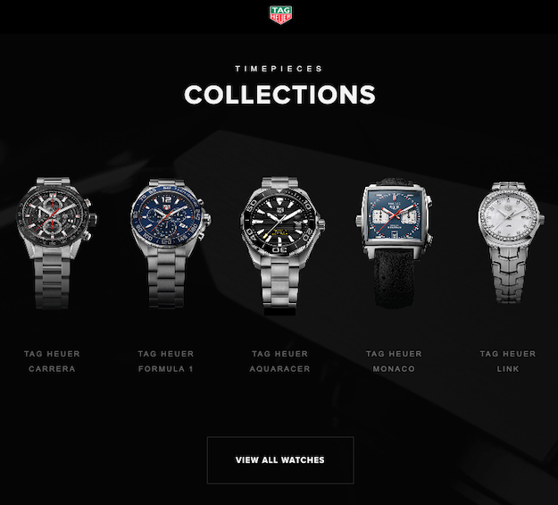
Black - Power
Black is used a very strong color which builds a sense of power with simplicity and elegance -
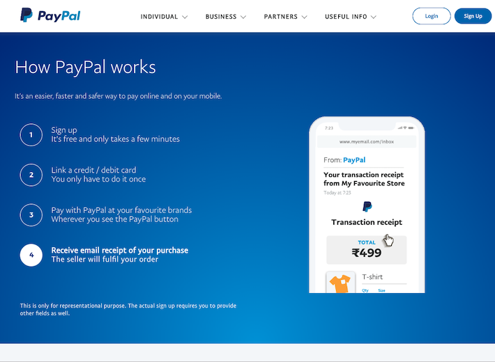
Blue - Reliability
Blue is a refreshing cool color used in designing for professionalism, trust and mass-appeal -
Green - Eco-friendly
Green is considered color of calmness and abundance of nature. It is relaxing and can balance the stronger emotions conveyed in texts -
Purple - Faith
Purple has been historically a rarer color affordable to wealthy and royals. It inspires imagination (romance) and affluence -
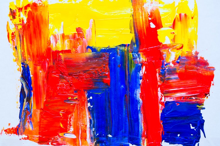
Red - Caution, Attention
Red usually raises caution, anger and should be avoided in interfaces where trust could be an issue -
Yellow - Youth
Bright shade of yellow evokes cheerfulness but can also look brazen. In less contrasting color schemes, a darker yellow can be very elegant -
Orange - Vibrance, Vitality
While it is widely used for natural or appetizing displays, it sometimes also represents generational changes. It commands attention by not being overbearing.
Regional variations - Ofcourse, there are regional variations one must be aware of while deciding the color palette. While western business world avoids Red, it is considered very auspicious in China and signifies prosperity. In India, red is traditionally feminine and in many cultures, red is strongly associated with communism. pink and yellow widely used for young generation
Color combinations - High contrast complementary colors like blue-yellow are widely recognized in new age digital interfaces (see flipkart) . Monochrome is commonly used where brand value is well understood and functional attributes take precedence. Neutral colors are used for elegance and emphasizing the core value or content.
“Black” in Tag Heuer website to target men
Do the red croissants look appetizing ?

Blue emotes trust in payments
 Defining Product Vision and deciding what/why to build